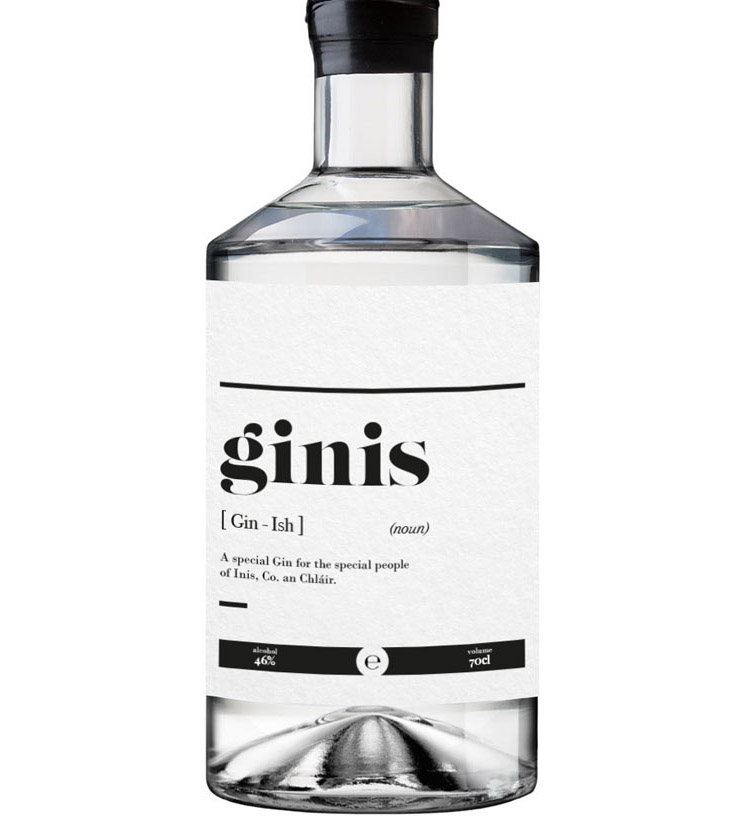
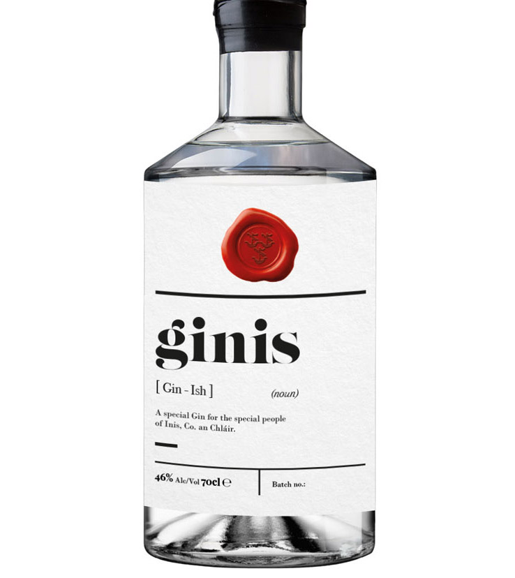
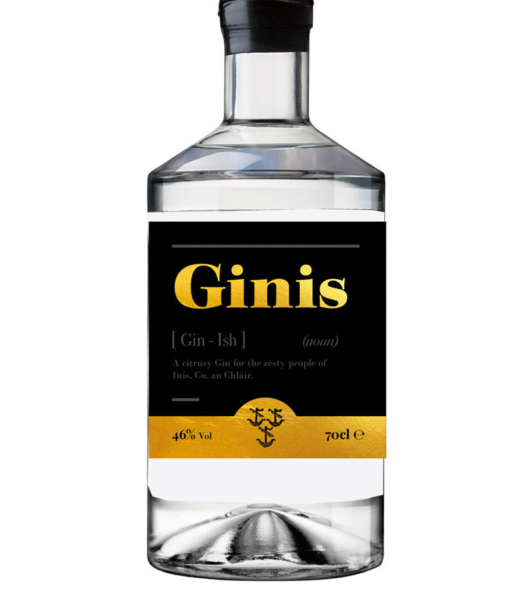
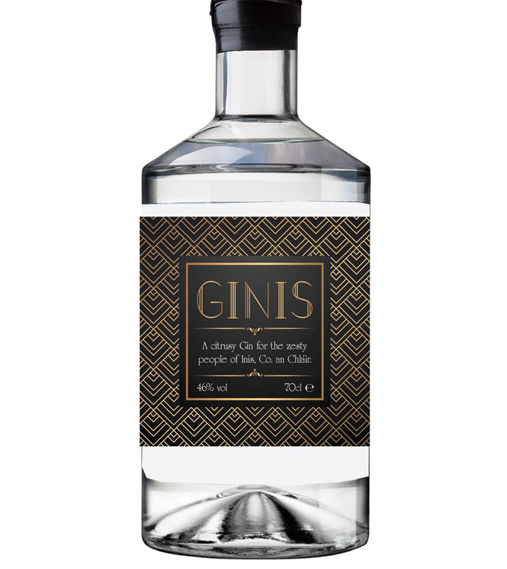
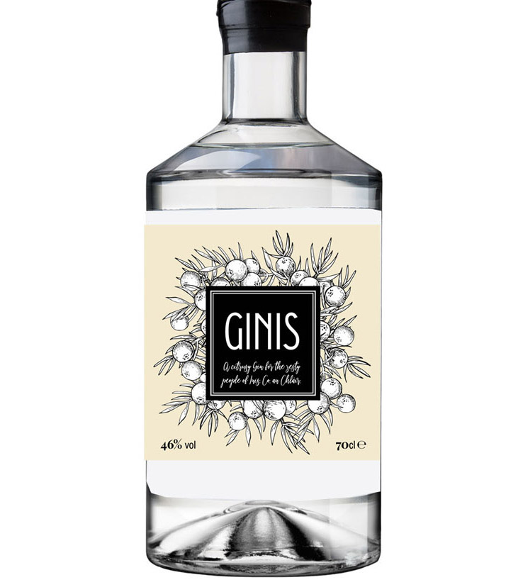
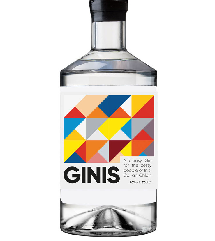
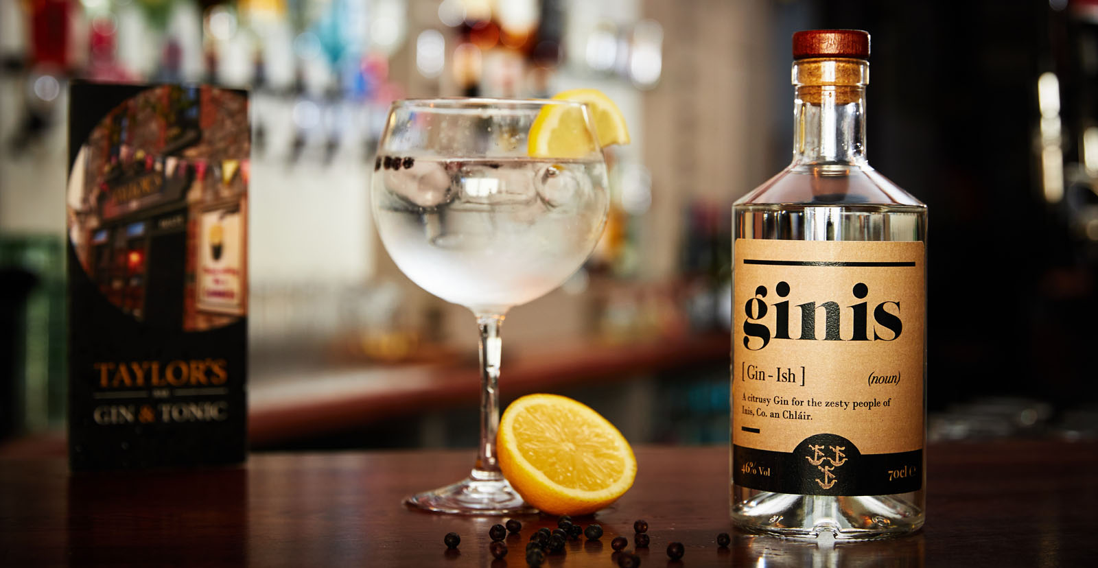
Case Study

Ginis

/
Ginis
THE OVERVIEW
To celebrate the official Clare Food and Drink Fleadh, 2019, it was decided to produce their own bespoke Gin to mark the occasion. This was to to be a small batch run. They required a simple branding to incorporate the 3 boats on the emblem of Ennis. Budget was an issue in the design process, which meant there was to be no special print techniques such as foiling, embossing, transparency etc. And stock size labels and bottles would be used to keep costs to a minimum.

View Website

01
The name of the product “Ginis” was derived from “Gin” (obviously!) and “Inis” which is the Irish language translation for the town of Ennis, in Co. Clare. While people were positive about the name, I felt it may cause some confusion, so an initial concept was to use a dictionary definition type design.
02
Some more traditional and modern variations were also explored. I decided that these types of design could really have benefited from some print techniques, such as gold foiling for the first example, embossing for the second, and perhaps a transparent label finish for the more modern third sample, which when placed on a bar shelf would allow any back lighting to really highlight the product and overall modern feel. Unfortunately due to budgetary constraints these would not have been possible. Oh well!
Final Design
The final design became a combination of the initial concept, incorporating the definition style design, with the 3 boat emblem. It was decided to change the overall colouring to match in with the cork and wooden cap colouring of the stock bottles to be used. The shelf impact of the large bold lettering was also a deciding factor, especially when stocked side by side in situ, as these types of product regularly are.